CAPTAIN BARBELL COSTUMES THAT DIDN'T MAKE THE CUT
It's been a while since I've updated this blog, no? But anyway, I'd like to share the initial costume redesigns I did for the recent version of Captain Barbell. Here we go...

Among the four costumes shown here, this is my favorite. I went back to the colors most associated with Cap, but made the blue darker. To give him touches of metal texture (to associate him with is namesake, the barbell) I gave him a breastplate and metal accents on his wrists and boots. I think it gives a regal quality without it being outdated. I also tried the almost-sleeveless look, to hearken back to what Mars Ravelo intended originally, that of a circus strongman look without necessarily having him go shirtless like his original costume.

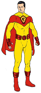
This is the closest to the previous "all-yellow" look, with the metal piping and metal emblem, now bigger for more visibility. To liven up the colors I added blue and red, again the colors most associated with him. The belt buckle looks like a barbell plate, and touches of metal were also added, like the armbands and the steel-toed boots.
This was my second choice, a bit sleeker with some deep red metallic accents to break up the monotony of the yellow. The cape is more incorporated into the costume, and also shorter than what we're used to (similar to Captain Marvel) so it won't get in the way when he engages in fisticuffs. The chest emblem was made to look more like his original emblem, the one seen on the belt buckle of the shirtless version. Again, the belt buckle looks like a barbell plate.

Here's anothe sleeveless version. I think it works well for Cap. Although that would require the actor who will play him to work out in order to achieve those shoulders and biceps. Maybe that's one reason the sleeveless look was disapproved. :) I purposefully simplified this version, since it's become de riguer for superhero costumes to have unnecessary design elements (I'm looking at you, DCnU). To overcome the simplicity, I went with the metallic accents again, with barbell plates on the boots, armbands and buckle. The chest emblem design gradually flows into the form of the cape, and I think the resulting shape near his shoulders look a bit like wings, suggesting the power of flight.
As the title says, these designs weren't approved. They wanted a much more sleeker design, so I did versions of that. I'll post them next time, and one of those designs led to the costume that Richard Gutierrez donned in the 2011 TV series.
Amusingly, the intention was for the costume to look sleek, but the final costume constructed for the TV series turned out to be bulky. Sigh.

 Antonella Caputo and Reno Maniquis's "The Murders in the Rue Morgue" is everything you could want for an adaptation of the classic story. Caputo's cuts are judicious, keeping the flow of the story intact. The characters of the proto-Holmes and Watson and the world they live in come to life in Maniquis's art. It has a naturalistic feel to it, which makes the horrific moments that much more dramatic.


